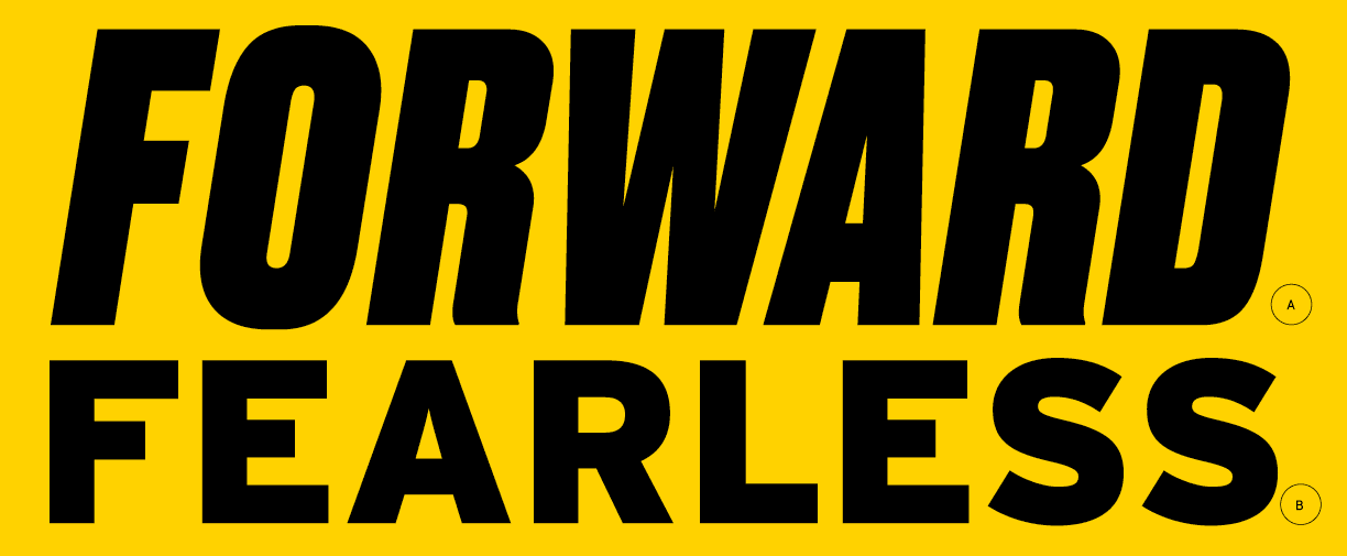
Fearlessly Forward
What we do and how we do it matters. Here, the way forward is clear.
The brand campaign tagline builds upon the brand recognition of the university's last tagline, "Fearless Ideas," by incorporating "Fearlessly." Adding a verb before the tagline strengthens its theme of forward momentum.
Here, we lead Fearlessly Forward.
Together, we go Fearlessly Forward.
When using the tagline in marketing copy, capitalize the first letters in "fearlessly forward" and italicize both words: Fearlessly Forward.
Word Mark

Word Mark Identity
The Fearlessly Forward word mark should be used in brand marketing and advertising campaigns. It does not replace the use of the University of Maryland logo lockup.
The word mark can appear alone or it can be paired with the university logo.
If Fearlessly Forward is used in a headline, it does not need to be repeated with the application of the word mark.
Spacing and Minimum Sizes
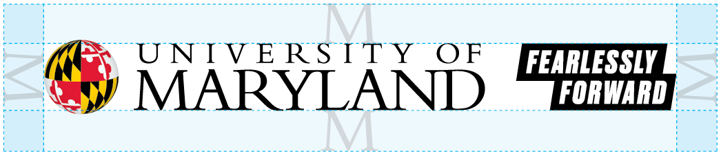
To maintain the integrity of the logo lockup and avoid visual clutter, adhere to the positioning guidelines as shown. Build a "comfort zone" around the logo lockup to let it shine. No copy, imagery or other graphic elements should infringe upon this area.
The minimum clear space for the logo is defined as the height of the "M" in the university word mark.
Print > 0.5” height
Web > 70 px height
Standard Lockup
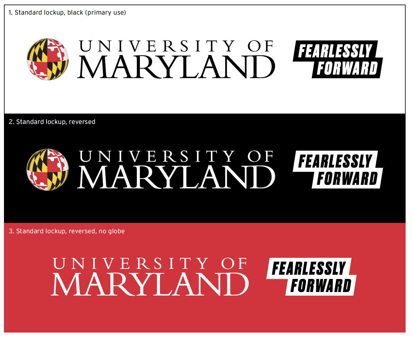
There are four versions of the Fearlessly Forward standard lockup:
1. The standard lockup
2. The standard lockup, reversed, to overlay on a solid color background or imagery.
3. The standard lockup, reversed, with no globe
4. The standard lockup with no globe (not pictured)
School, College and Unit Lockups

Campus entities are permitted to use the Fearlessly Forward lockup when using the university-approved logo that positions the University of Maryland ahead of the school, college, or division name. This is not permitted for departments, centers and institutes, programs or initiatives.
Correct Usage
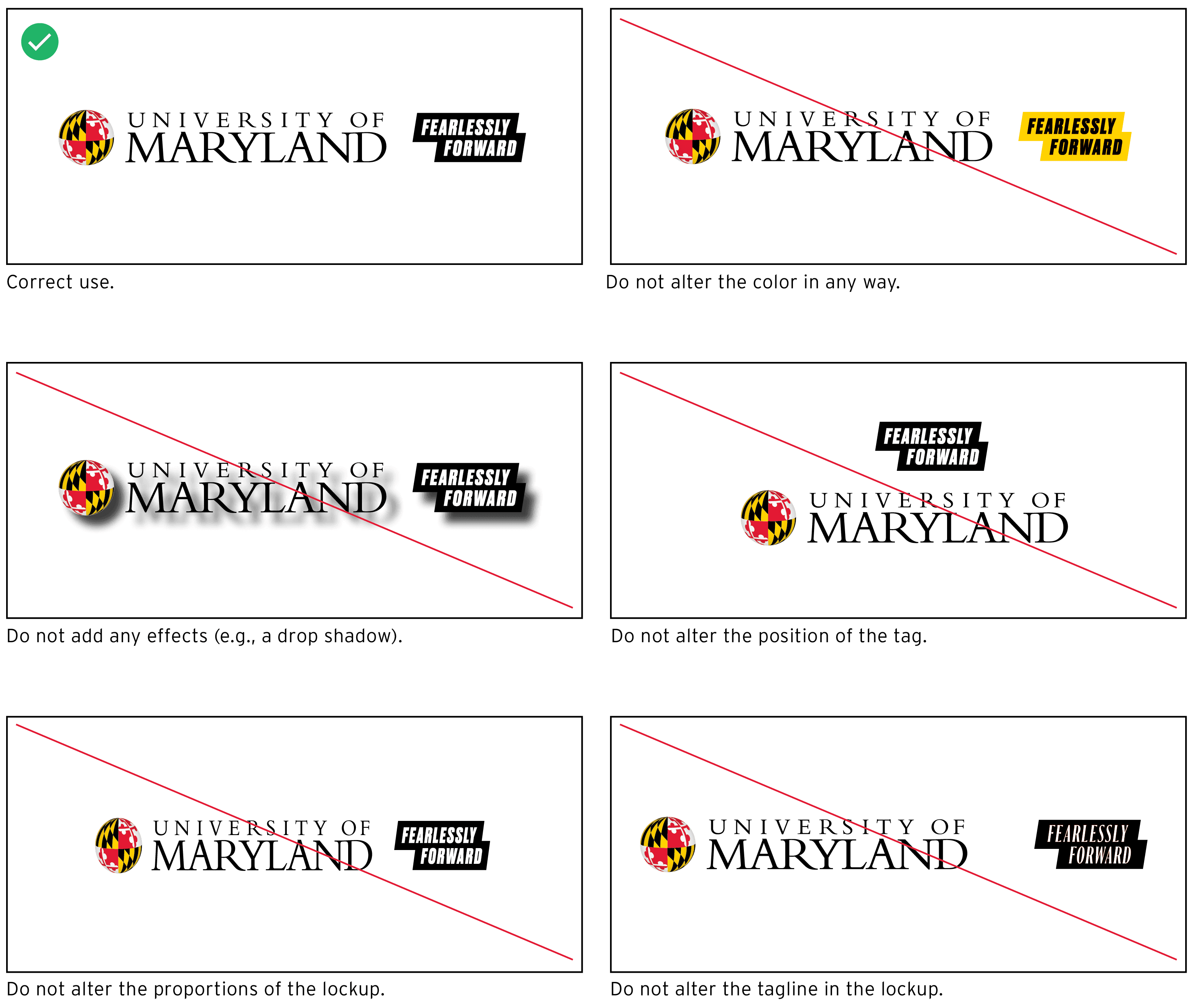
The effectiveness of the lockup depends on consistently correct usage. See the brand book for additional examples.
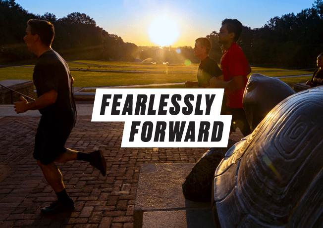
Standalone Word Mark
The Fearlessly Forward word mark can be used alone and can be placed on top of a solid background or an image. Do not stretch or distort.
Typography
Typefaces
Typography is important to the voice of our brand. We use bold, evocative typography to match our voice. Druk and Interstate match the brand's best qualities.
A. Druk
Use Druk Heavy Italics in headlines. This bold and expressive font was designed by Berton Hasabe of Commercial Type.
B. Interstate
For everything else, use Interstate, a workhouse typeface built by Tobias Frere-Jones and licensed by Font Bureau. Interstate's familiar feel compliments Druk and serves as body copy across screen and print.
Type for Print
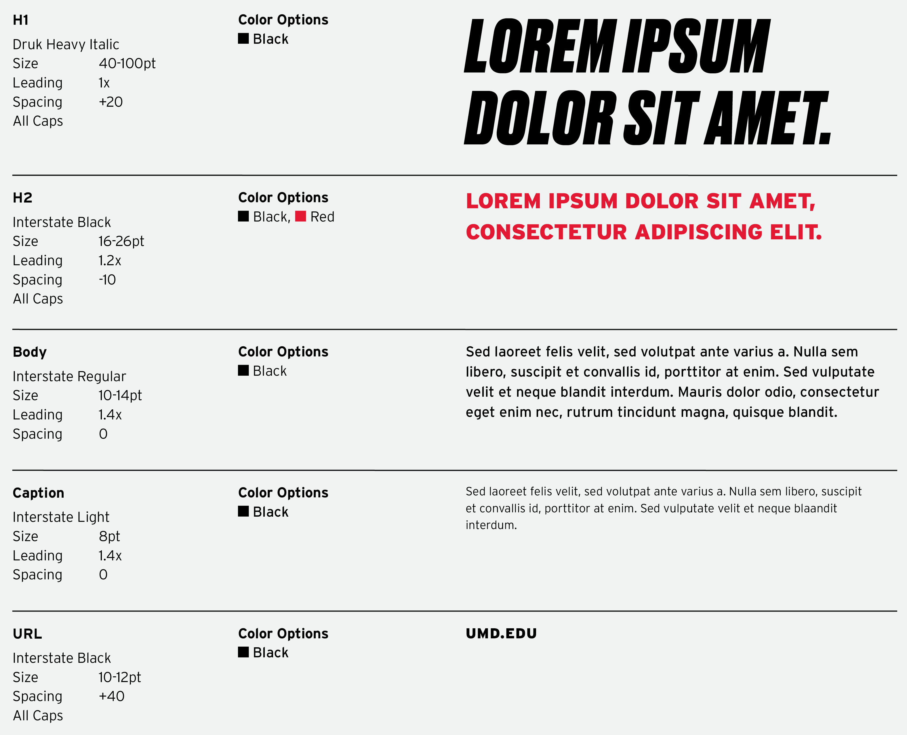
To the right is a schematic for how to set headlines and body copy in print applications.
When using the tagline in marketing copy, capitalize the first letters in "fearlessly forward" and italicize both words: Fearlessly Forward.
Headline Treatment
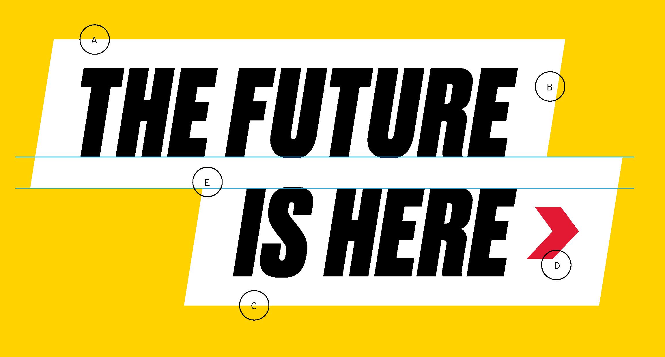
A. The Shadowbox
The parallelogram behind the text is white, and the slant matches the angle in the type. Its height should be approximately 1.67 multiplied by the text cap height.
B. The Type
Druk Heavy Italic is used for headlines.
C. The Position
To reinforce the messaging, place the next line staggered to the right—forward. How much depends on the words used and is at the designer’s discretion.
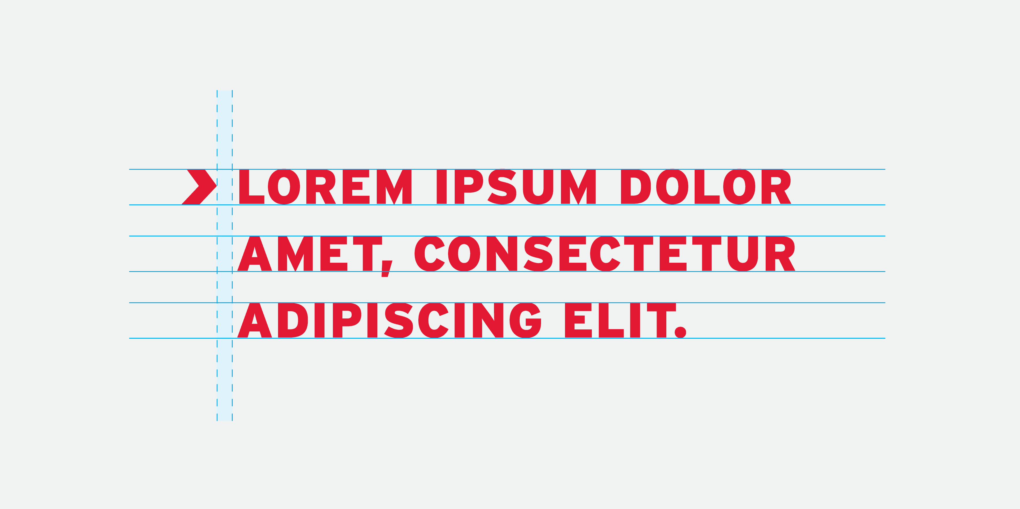
D. The Arrow
Use the arrow to lead the eye from the headline to subheadline. Make the arrow 58% of the cap height of the type, and insert it as a text object, separated from the last letter by one space. The arrow should always be facing forward to illustrate forward movement.
E. The Alignment
The top of subsequent lines of text should align with the bottom of the above shape. Bottom of the text aligns with the top of the shape below.
Headline Examples
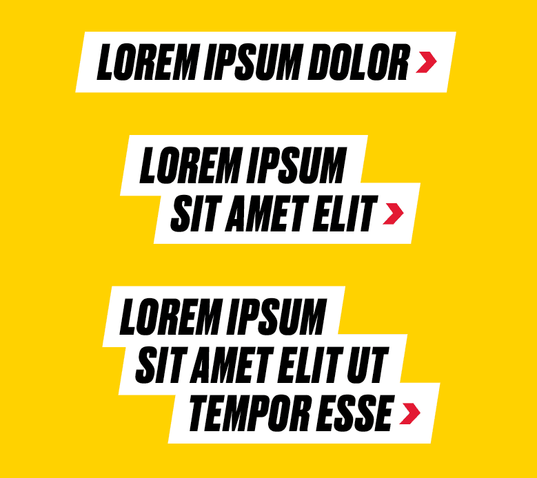
The best headlines are short and to the point. Avoid exceeding three lines, if possible. At right are examples of one-, two- and three-line layouts.
Subheadline Treatment
Subheadlines build on the headline and draw readers to more information in the body copy.
Use the arrow icon to lead into the subheadline. It should stand on the left, separated by a space before the first letter of the first word. The subsequent lines will align with the first letter, not the arrow. (See right.)
Make the arrow leading into the subheadline the same height as the cap height of the text.
Pattern
Trim & Large-Scale Pattern
The pattern uses forward arrows to convey the energy and momentum behind the Fearlessly Forward campaign and incorporates each of our core brand colors. Do not alter the colors featured in the pattern or add additional elements to the design. To maintain consistency, the pattern should be used as is.

Download the Brand Book
Download the Fearlessly Forward Brand Book for campaign guidelines.
Campaign Toolkit
The Office of Marketing and Communications has prepared design templates to encourage personalization within the framework of the Fearlessly Forward campaign. Access the Fearlessly Forward Brand Campaign Toolkit by logging in to your UMD Box account.
Product Catalog
This catalog includes an assortment of Fearlessly Forward branded promotional products, environmental signage, and folders available for purchase. Orders can be placed directly with the vendor.