Email Guidelines
Purpose
University of Maryland campus partners produce more than 200 e-newsletters and many more standalone email communications every year to share important information with their communities. Using the university's visual identity and following best practices for email communications will ensure that our messages are clear and impactful and will ultimately strengthen the UMD brand.
The Office of Marketing and Communications has the formula for a great email > a Compelling Subject Line + Strong Design + Engaging Content = SUCCESS
Subject Lines
The subject line is the first thing your audience sees, so having the wrong one could lead to your email being overlooked in your recipients’ inbox. Follow these guidelines to create compelling subject lines that will help cut through the noise and lead to higher open rates.
- Avoid using all caps or capitalizing every word in your subject line. Overusing all caps and unnecessary punctuation can trigger spam filters and can seem aggressive. Instead, capitalize only the first letter and proper nouns. Campaign Monitor has compiled a list of “The 15 Most Powerful Words in Subject Lines.”
- Good: This is a good subject line
- Bad: This is A Bad Subject Line
- Keep subject lines short and simple. Ideally, we recommend using six to 10 words to minimize the risk of your subject line being cut off. Use as few characters as necessary to give a snapshot of what your email is about.
- Example: Calling all Terps: Let's connect!
- Use preheaders to add valuable context to your subject lines. Subject lines can only be so long, and in some situations, you need more details to entice your audience to open your email. Make your subject line and preheader work together to effectively communicate the most compelling benefit of your email. This will help your email stand out and boost open rates. Similar to subject lines keep them short and to the point.
- Example
- Subject line: [First Name Recipient], you're invited!
- Preheader: Join us on July 26 for Terps on the Hill
- Example
- Personalize. Depending on your email platform and what data is being captured, personalization tokens such as “First Name, Last Name” may be available and should be taken full advantage of to grab recipients' attention. According to Campaign Monitor, emails with personalized subject lines are 26% more likely to be opened.
- Example: [First Name Recipient], your exclusive invite is waiting
- Consider using emojis to add fun and creativity. Your recipients are exposed to many emails per day, so adding an emoji can help make yours stand out. Use emojis to supplement rather than replace words to ensure your main message gets across. It is also important to test them because not every email client supports emojis, and your recipients might get a special character or a different version. Finally, avoid overusing them, which can look like spam. Learn more about how to properly use emojis in subject lines.
- Example: This week ➡ Terps make great discoveries around the world 🌎
- Pique your audience's attention by
- Creating a sense of urgency: Encourage immediate action to reduce the chances of your email being skipped over. Example: ⏲ Last chance: Terps Under 30 is next week! OR
- Creating a sense of mystery: Entice recipients to open your message to find out more details about an upcoming event or promotion. Example: You won’t believe what’s happening next week on campus! OR
- Asking a question: Make your subject line conversational to establish a relationship with your audience. Ask a question in your subject line and involve your subscribers in the conversation. Example: Will you help drive UMD Fearlessly Forward on March 8?
Email Design
Once your audience has opened your email, it must keep readers engaged with, eye-catching images and an intuitive layout. OMC has developed templates that adhere to email design best practices and feature the university’s visual brand identity. They are available to download on the OMC brand website.
Consider the following when designing a new email: font, color, visual elements, call-to-action buttons and mobile friendliness.
Header
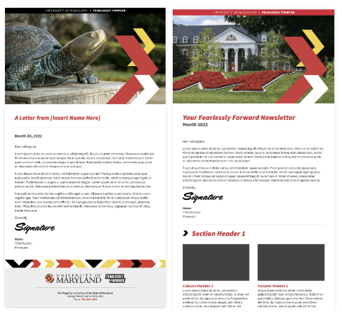
All emails should incorporate one of the University of Maryland Fearlessly Forward headers in red or black, available to download on the OMC brand website.
Footer
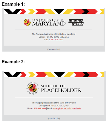
To be CAN-SPAM-compliant, your email will need a physical address and an unsubscribe link. Campus partners should follow one of the two formats below:
Color and Font
The University of Maryland's core brand colors are red, white, black and gold. Inspired by the Maryland state flag, these colors reflect our role as Maryland's flagship university. The university encourages the use of all four colors as they represent a core element of its visual identity. View the full-color palette and identify color combinations that are compliant with accessibility guidelines.
The following three digital fonts adhere to the Maryland brand and should be used for all email communications:
- Crimson Text
- Source Sans
- Roboto Condensed
Visit the typography page of the brand website for more information on approved font styles and colors.
Other Style Guidelines
Headings
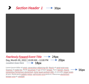
For email newsletters set the following to:
Design: Email Newsletter
Heading 1 - 30px
Heading 2 - 24px
Heading 3 - 20px
Heading 4 - 18px
Body text - 16px, black (#000000) or dark grey (#454545)
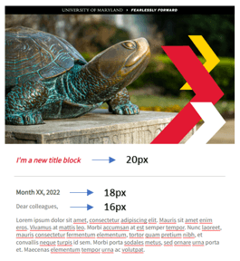
For email letters set the following to:
Design: Email Letter
Heading 1 - 20px
Heading 2 - 18px
Body text - 16px, black (#000000) or dark grey (#454545)
Email Padding
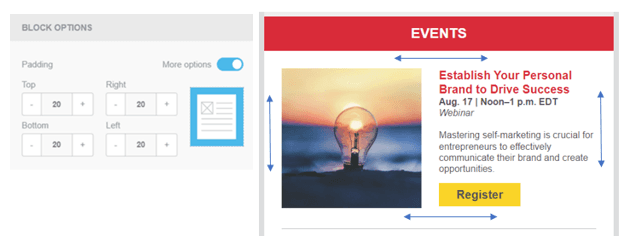
Apply 20px padding around all sections to create white space between email elements. Text should never span the full width of your section. Embrace white space to make paragraphs easier to read and improve clarity.
Text Blocks
Left-align blocks of text. Centered paragraphs can be harder to read and can create extra spacing.
Image Quality
Images need to be clear, high-quality and no bigger than 500KB (AlumniQ) or 5MB (Salesforce Marketing Cloud). Accepted file types include JPEG, PNG and GIF. For more information, see the Visual Elements section below.
Visual Elements
Visual elements play an important role in capturing recipients’ interest but should be used strategically and sparingly. Emails that are too image-heavy can:
Create a poor user experience. If recipients have selected platform settings that turn email images off and alt text is not included, your email will not communicate anything and will fail to make an impact.
Hurt your email’s accessibility. Emails that rely heavily on images will make it challenging for visually impaired subscribers to digest a message. Aim for more illustrative images that reinforce the text in case the assistive technology malfunctions and does not recognize alt text or other HTML attributes.
Cause emails to load slower than usual. The longer it takes for your email to load, the more likely your subscriber will disengage.
When in doubt, choose quality over quantity.
The most popular and widely accepted file formats for email platforms are JPEG, PNG and GIF. Resize images depending on the layout of the email template using Photoshop, available to download for UMD employees via Terpware. Some standard image sizes include:
Email Header: 16:9 ratio, 1920 x 1080
Email Body Banner: 2:1 ratio, 1080 x 540
Email Strip Banner (2 Column): 16:9 ratio, 230 x 129
Email Strip Banner: 5:1 ratio, 500 x 100
Email Banner Dimensions

Pre-Send Email Design Checklist
✅ Email preview renders correctly across mobile and desktop
✅ HTML is accompanied by plain text that includes all hyperlinks in brackets
✅ Links work correctly and are tracked appropriately (Ex. UTM parameters)
✅ There’s enough white space around text blocks and visual elements
✅ Content has a logical flow with good line spacing and readable fonts
✅ Dynamic content and personalization is tested and fallbacks are in place
✅ Calls to action are strong and compelling
✅ Spelling and grammar is reviewed
✅ Footer includes a physical mailing address, contact information and unsubscribe link
Accessibility Guidelines (ADA Compliance)
Accessible emails ensure that all members of the University of Maryland community can engage with our content. In alignment with updated Americans with Disabilities Act requirements for digital accessibility, all UMD email communications must adhere to updated ADA digital accessibility requirements by April 24, 2026.
Alt Text

Apply alternative (alt) text to all images so content is accessible to screen readers and remains usable if images do not load. In this example, alt text would be: “The red flower-filled M on Campus Drive.”
- Alt text should describe what is shown in 125 characters or fewer.
- Be descriptive and concise.
- Do not use phrases such as “image of…” or “picture of…”.
- Include alt text for photos, graphics, icons and logos.

Adding Alt Text in AlumnIQ
- Open the email builder and select the image you want to add alt text to.
- The right-side panel will appear.
- Under the Content tab, add the image URL (if applicable) and enter the alt text.

Adding Alt Text in Marketing Cloud
- In Email Studio, open your email and select the image you want to add alt text to.
- The left-side panel will appear.
- Under the Content tab, add the image URL (if applicable) and enter the alt text.
Color and Contrast
Color choices must support readability for all users. Poor contrast can make content difficult or impossible to read.
- Maintain sufficient contrast between text and background colors.
- Do not rely on color alone to convey meaning.
- Use approved UMD brand color combinations that meet accessibility standards.
- Allow sufficient white space around text blocks and visual elements.
Typography
Typography plays a critical role in readability and comprehension. Clear, consistent text ensures content is legible across devices and assistive technologies.
- Use simple, UMD approved, web-safe fonts.
- Body text should be at least 16px, footer text at least 14px and headings should be larger than either (see the Design section above for guidance on heading sizes).
- Avoid excessive use of all caps, italics or decorative fonts.
- Use bold text sparingly for emphasis on clarity.
Structure and Hierarchy
A clear structure helps users quickly understand and navigate email content. It also ensures compatibility with screen readers, which rely on logical content order.
- Use headings and subheadings in sequential order (H1, H2, H3, etc.).
- When using a drag-and-drop email editor such as AlumnIQ or Marketing Cloud, apply heading styles rather than simply increasing font size or bolding text. This ensures proper semantic structure for accessibility tools.
- Break content into short paragraphs or bulleted lists.
- Keep layouts simple and predictable.
- Place key information near the top of the email.
For HTML-coded emails:
- Use proper semantic HTML elements such as <h1>, <h2>, <p>, and <ul>/<ol> to establish a logical content hierarchy.
- Avoid using tables for layout. If tables are necessary, assign role="presentation" so they are ignored by screen readers.
- Define the document language using the (lang) attribute.
Hyperlinks
Links should be easy to identify and clearly describe their destination.
- Use UMD red or black, underlined hyperlinks consistently throughout the email.
- Bold links when possible for added visibility.
- Describe the content or action behind the link.
Examples:
Watch the 2023 Graduate Commencement Ceremony
Visit the Alumni Association webpage to learn more
Avoid:
- Using “click here” or “view here.”
- Hyperlinking just one word.
Buttons
Use buttons to highlight a primary call to action (CTA) and guide users toward the most important next step.
- Use sparingly.
- Have a clear CTA. (What do you want readers to do?)
- Be concise (up to four words) and descriptive.
- Ideally, start with a verb (register, buy, download, etc.).
- Determine the best color, font and background combination that meets accessibility requirements.
- For a mobile-friendly design, use CTA buttons with a minimum width of 44 pixels and height of 44 pixels.
Examples:

Plain Text Version
All emails must include a plain text version to ensure content is accessible across all email clients and assistive technologies.
- Preserve the order and meaning of the HTML content.
- Include full URLs in brackets after links. Example: [https://brand.umd.edu/email-essentials]
- Avoid unnecessary symbols or formatting.

Adding Plain Text in AlumnIQ:
- Open the email builder and scroll to the Plain Text Body section (typically located in the middle of the page).
- Once your email is finalized, enter the plain text version.
- Format it properly, including adding links in brackets and removing unnecessary spacing or formatting.
- Save your changes.

Adding Plain Text in Marketing Cloud:
- In Email Studio, click the Content tab, then select the Plain Text tab located under the Subject and Preheader fields.
- Enter and format your plain text version, including adding links in brackets and removing unnecessary spacing and formatting.
- Keep the personalization strings at the bottom of the email (Ex., %%Member_Busname%%, %%Member_Addr%%, %%Member_City%%), as they are unique to each subscriber.
- Save your changes.
PDFs and Attachments
Attachments and linked documents must be accessible to all users. PDFs are common, but they must meet accessibility requirements.
- Start with an accessible source file (Ex. Word, Google Docs, Power Point) and add appropriate headings, lists, tables and descriptive links before exporting to PDF.
- Once a file has been exported to PDF, ensure it includes proper tags for headings, lists, tables and reading order. Use available accessibility tools to check if adjustments are needed.
- Add alt text for meaningful images; mark decorative images as decorative.
- Include document metadata (Title, Author, Language).
- Provide descriptive links to attachments, including file type and purpose (Example: Download 2026 Annual Report (PDF)).
- Consider web-based alternatives when possible; PDFs should be used only when necessary.
Mobile-Friendly Formatting
Emails must be readable and functional on all mobile devices. Poor mobile formatting can lead to missed information or user drop-off. Consider one of three options listed below to ensure your email is mobile-friendly.
| Description | When to use | What to Know | |
Mobile Aware | A single layout designed to scale down and still look good on mobile | Quick turnaround, low effort |
|
Responsive Aware | Responsive headers and footers | Repeatable elements, upfront effort | Header and footer modules include media queries allowing simple change and adaptation
Email body maintains mobile-aware tactics
|
| Responsive | Modular content adapts to device screen size | Optimal experience ongoing effort |
|
Table by Salesforce Marketing Cloud
Pre-Send Email Accessibility Checklist
✅ If your email can be viewed in a browser, its header reads: “View this email message as an accessible web page”
✅ Copy and background colors pass the color contrast test
✅ There’s enough white space around text blocks and visual elements
✅ HTML is accompanied by plain text that includes all hyperlinks in brackets
✅ Copy avoids the phrases “click here” or “view here”
✅ The minimum font size for copy is 16px
✅ Alt text is included for all images, and decorative images are marked as decorative
✅ Text is aligned left (no justified copy)
✅ Email is not too image-heavy
✅ Links are clickable/tappable and clearly descriptive
✅ Buttons are used for primary CTAs, are labeled clearly and meet minimum size requirements (44px × 44px)
✅ Email is mobile-friendly (single-column layout, adequate spacing, readable text)
✅ Linked PDFs or attachments are accessible and descriptive, including file type
✅ For drag-and-drop templates: use heading styles rather than just making text larger to create hierarchy
HTML-Coded Email Requirements
✅ Headings and content follow a clear, logical structure
✅ Semantic HTML elements are used (<h1>, <h2>, <p>, <ul>/<ol>)
✅ Tables are avoided for layout; if used, they include role="presentation"
✅ Document language (lang) is set for HTML-coded emails
Content
Now that you’ve piqued readers’ interest with a compelling subject line and strong design, encourage them to continue reading by creating content that is interesting, concise and easy to digest. It should have:
- A logical flow. Placing the most important information at the top makes your content easier to navigate and skim.
- A clear and short message. Structure your email as a “teaser” to drive subscribers to follow the email’s call to action, such as visiting your website for more information or signing up for an upcoming event. Learn more about creating easy-to-scan content.
- A consistent format. Consistency in content layouts helps educate subscribers on what they should expect when they open your email. For example, having hyperlinks in the UMD red, bold and underlined indicates that everything in that format is clickable.
- A target audience. Sending the right message to the right people is key in email marketing. So, it’s important to create individualized content based on audience segmentation, which leads to higher click-through rates, better email deliverability and lower unsubscribe rates. Some common ways to segment data are:
- Interests: What interests have your subscribers indicated in their profiles?
- Behavior: What are your subscribers clicking on or signing up for?
- Geographic location
- Academic year
- Gender
- Age
Email Metrics
Preview, Test, Analyze and Improve
Before you hit “send,” preview and test your email message to ensure it is rendering properly on different devices and for different email clients (Gmail, Yahoo, Outlook, etc.). Thoroughly proofread your subject line and copy.
After sending your email, review your data to help you understand what worked and optimize future email marketing campaigns. Analyze the following key performance indicators (KPIs) to measure the success of your email marketing campaigns:
Open rate: How many people opened your email. Please note that Apple’s email privacy protections have made it more difficult to accurately measure and track open rates; however they are still a strong indicator of how much your recipients trust your brand and want to read your emails. If your open rate is low, try:
- Regularly cleaning your subscriber lists
- Conducting subject line A/B testing
- Resend unopened emails
- Having a regular email cadence (ex. Newsletter is sent the first Wednesday of every month)
Open Rate Formula
[Emails Opened] / [Emails Sent - Bounces]
Click-through rate: The percentage of people who open your email and click on one or more links. Use this KPI to measure how engaging your content is and how clearly your message was conveyed.
Click-Through Rate Formula
[Unique Clicks] / [Delivered Emails]
Clicks by link/URL: Unique clicks on a link within an email. This helps identify what content is grabbing your subscriber’s attention and the quality of the flow of your email. If people are clicking only on the first link and not on your main CTA button, then you might have to readjust the flow.
Unsubscribe rate: The percentage of unsubscribes per deliveries. High unsubscribe rates mean subscribers are opting out because the content is not relevant to them. When necessary, make changes to your marketing strategy such as:
Further segmenting your data
Changing the cadence of your emails
Changing your messaging
Changing your communication channel
Unsubscribe Rate Formula
[# of Unsubscribes] / [# of Emails Delivered]
Bounces: A hard bounce is when an email is no longer active or is in some way invalid. Examples: if someone has changed their email address or if the email address that was uploaded had a typo. A soft bounce is when someone’s inbox may be full, or something else is preventing the email address from going through. To keep this metric low, regularly update your contact list and upload emails accurately.
Bounce Rate Formula
[Total Bounced Emails/Total Attempted Emails] x 100
Salesforce Marketing Cloud Guidelines
Template Approval Workflow
To ensure brand consistency and uphold the university's brand identity, the Office of Marketing and Communications (OMC) has established an email template approval process for all new templates used in Salesforce Marketing Cloud (SMC). This workflow also ensures that email templates meet best practices and accessibility standards, contributing to effective and credible email communications.
Key Steps:
- Template Review and Approval: OMC will review and approve all email templates before they are imported into Marketing Cloud and made available to business units.
- Ongoing Template Audits: Any new templates created after the initial audit will also need to be reviewed and approved by OMC.
- Email Send Approvals: For newly onboarded business units, OMC will review and approve the first three email sends to ensure adherence to email best practices. This will be managed through Marketing Cloud's approval workflow, which prevents emails from being sent until they receive OMC approval.
This process is designed to maintain high standards and ensure the success of email communications across the university.
Standardized Email Preference Centers
To ensure effective communication and reduce email fatigue, campus partners using SMC should implement a clear and organized subscription category strategy. This approach allows recipients to customize the information they receive, ensuring that communications are relevant and aligned with their interests.
Important: All emails containing marketing content are considered commercial emails, and subscribers must have the option to opt out of the list used to send the email. This includes newsletters, event invitations and promotional offers.
Key Steps:
- Subscription Category Audit: An audit of subscription categories will be conducted during the onboarding process to streamline options.
- Unsubscribe Options: All email templates must include at least one of the following unsubscribe options:
- One-Click Unsubscribe: Allows recipients to opt out of the specific publication list used for that email with a single click.
- Email Preference Center: Enables recipients to manage all of their UMD email subscriptions and choose their communication preferences.
This approach will help maintain an organized subscription system and enhance the recipient's experience.
Centralized Email Calendar
Applies to alumni or donor audiences of 1,000 or more recipients.
The Office of Marketing and Communications will manage a centralized email calendar for all alum and donor email communications to support the following strategic priorities:
Reduce redundant messaging and conflicts: Ensures a balanced distribution of information, so important messages aren’t missed.
Minimize unsubscribes: Helps manage email frequency to address concerns of email overload, as our survey data revealed “too many emails” is the top reason recipients unsubscribe from UMD communications.
Coordinate critical communications: Allows better scheduling of emergency messages and large campaigns like Giving Tuesday and Giving Day.
Promote Collaboration: Enhances coordination among campus partners to strengthen messaging.
Key Steps:
- Campus partners must secure a date and time for emails targeting an audience of 1,000 or more recipients that are alumni or donors through the Office of Marketing and Communications (OMC). The procedure is as follows:
10 days out: Campus partner will secure a send date and time by filling out our Email Request Form and selecting “Secure Email Send Date & Time”
3 business days out: Campus partner will submit Email Request Form (“Check & Release Email”) with details of the drafted email.
- Campus partners will follow an email naming convention that will allow OMC to easily identify communications targeting alumni and donors.
- Business Unit - Email Name (Audience) - Email Send Date
Ex. BSOS - December E-Newsletter (Alumni) - 12.12.24
Ex. AG - Giving Day Email 1 (Donors) - 2.23.24
- Business Unit - Email Name (Audience) - Email Send Date
- The Alumni Association will continue to secure a date and time for all emails with OMC.
Contact Information
- If you have any questions, reach out to the Office of Marketing and Communications Email Marketing Manager Myriam Fuentes at myriamf@umd.edu.
- To request a campuswide email communication, please email emailrequest@umd.edu.
- Please complete the Email Request Form to do the following:
- Secure an email send date and time,
- Schedule a check-and-release email,
- Open a new email design request, or
- Seek other email marketing support.
A member of the OMC email marketing team will be in touch in one to three business days to confirm receipt and next steps.